Enter password to view case study
Unified duplicate user accounts to streamline access and reduce friction

Client
Cox Automotive
Role
Senior UX Design lead
Duration
12 weeks
Scope
User Research, Prototyping, Usability Testing, Competitive Research, UX Writing
Background
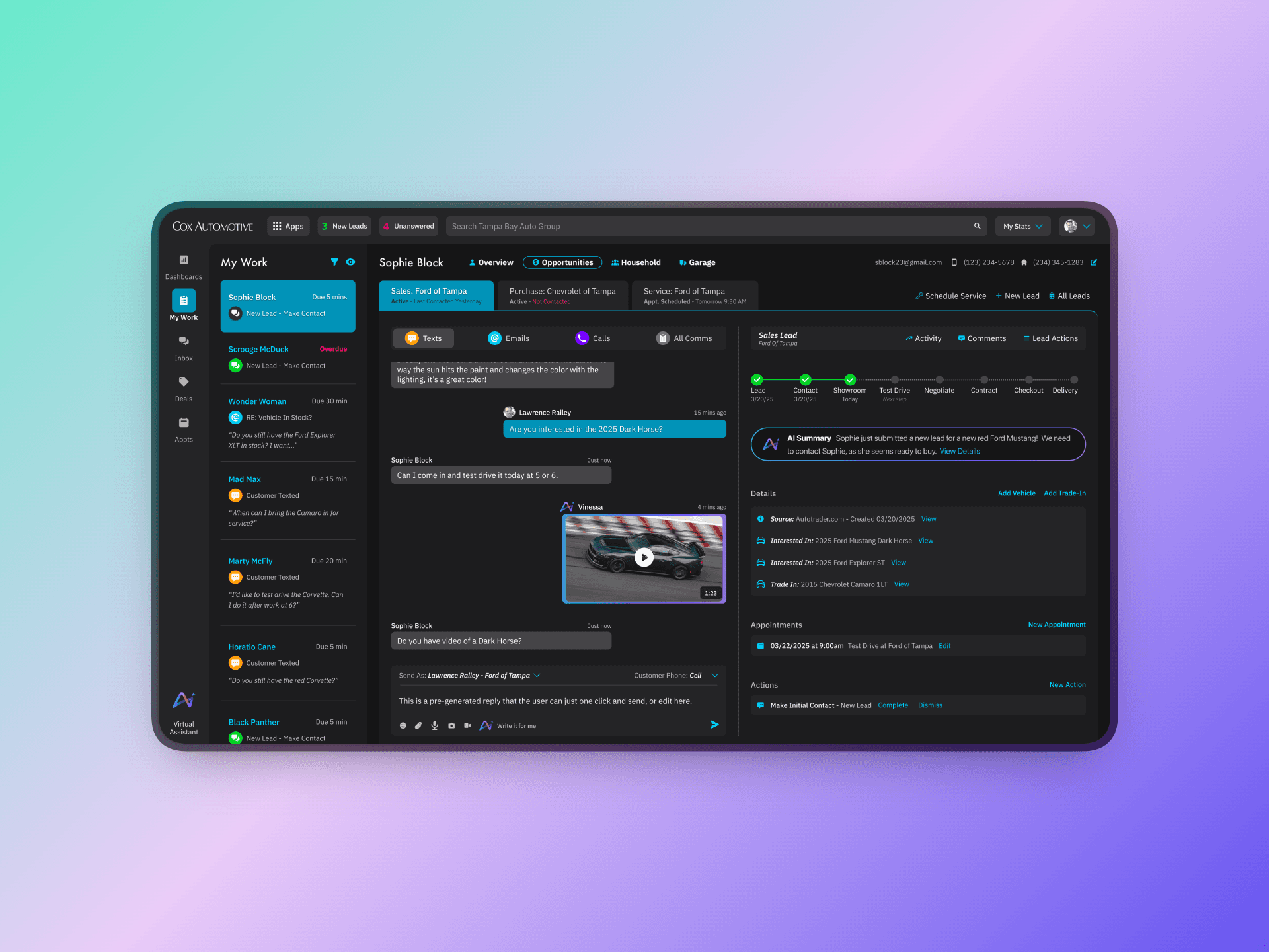
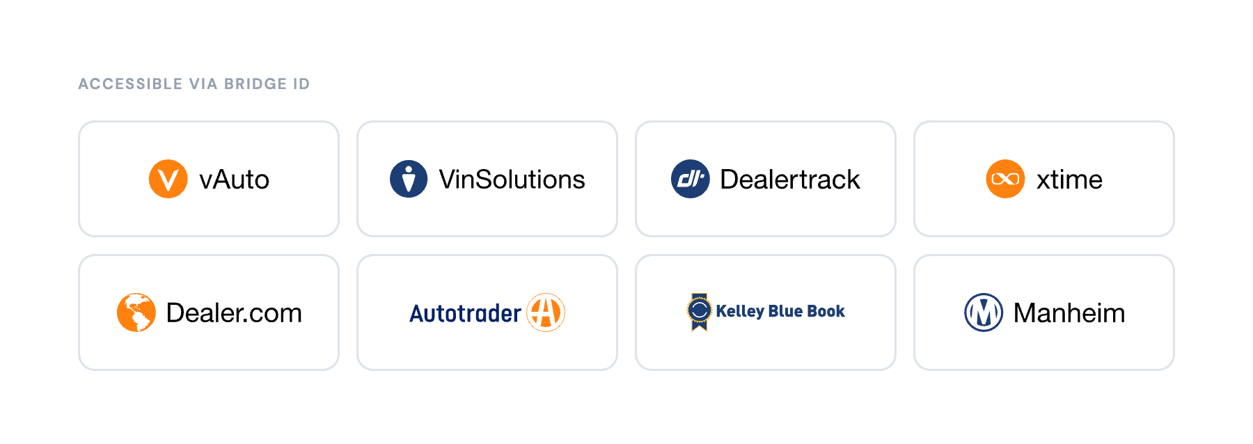
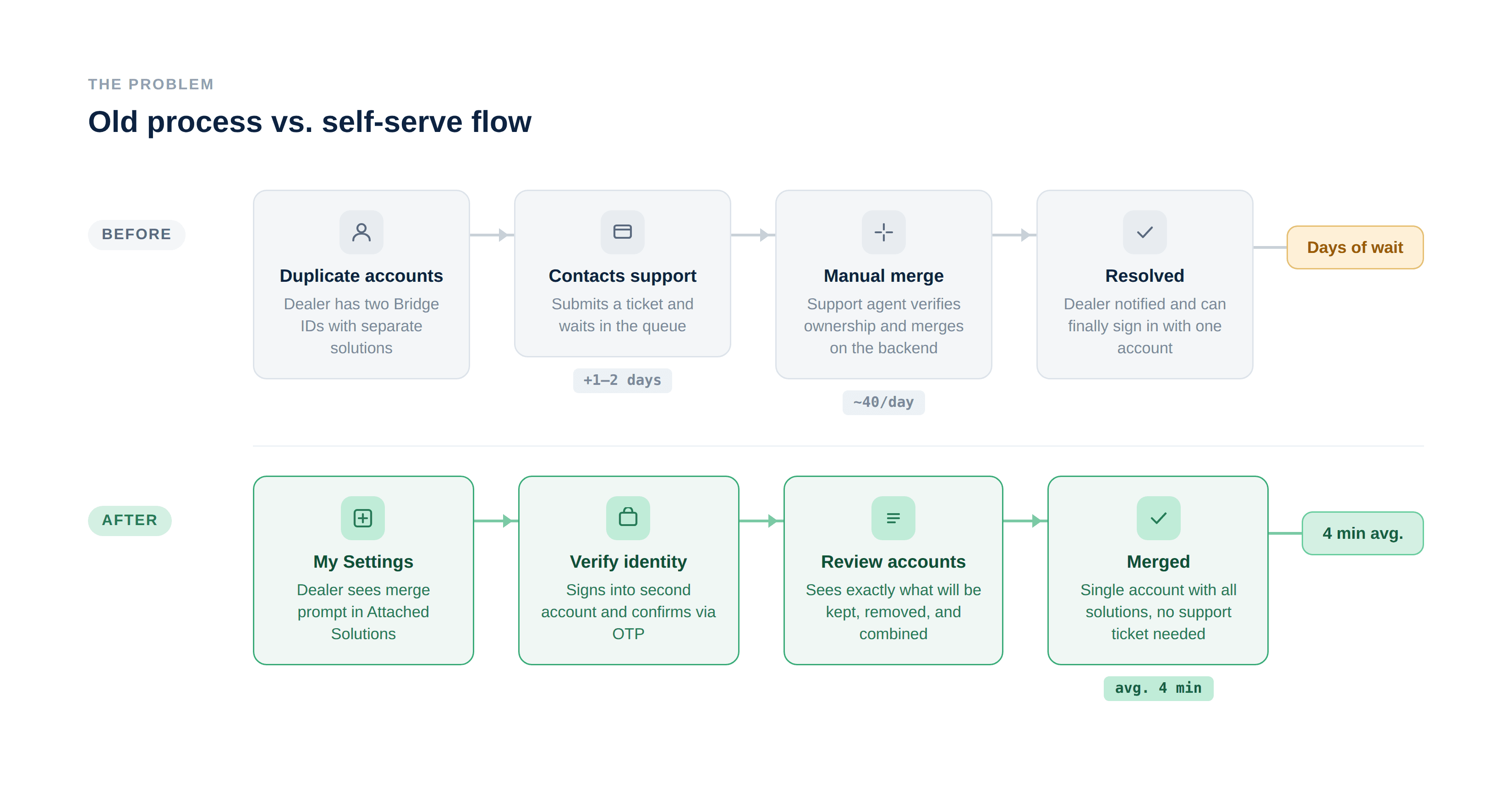
Cox Automotive's Bridge ID is a single sign-on platform that lets dealers access products like vAuto, VinSolutions, Dealertrack, and Xtime from one login. The problem: many dealers had ended up with duplicate Bridge ID accounts over the years often created when they switched dealerships, onboarded to a new product, or simply forgot they already had an account.
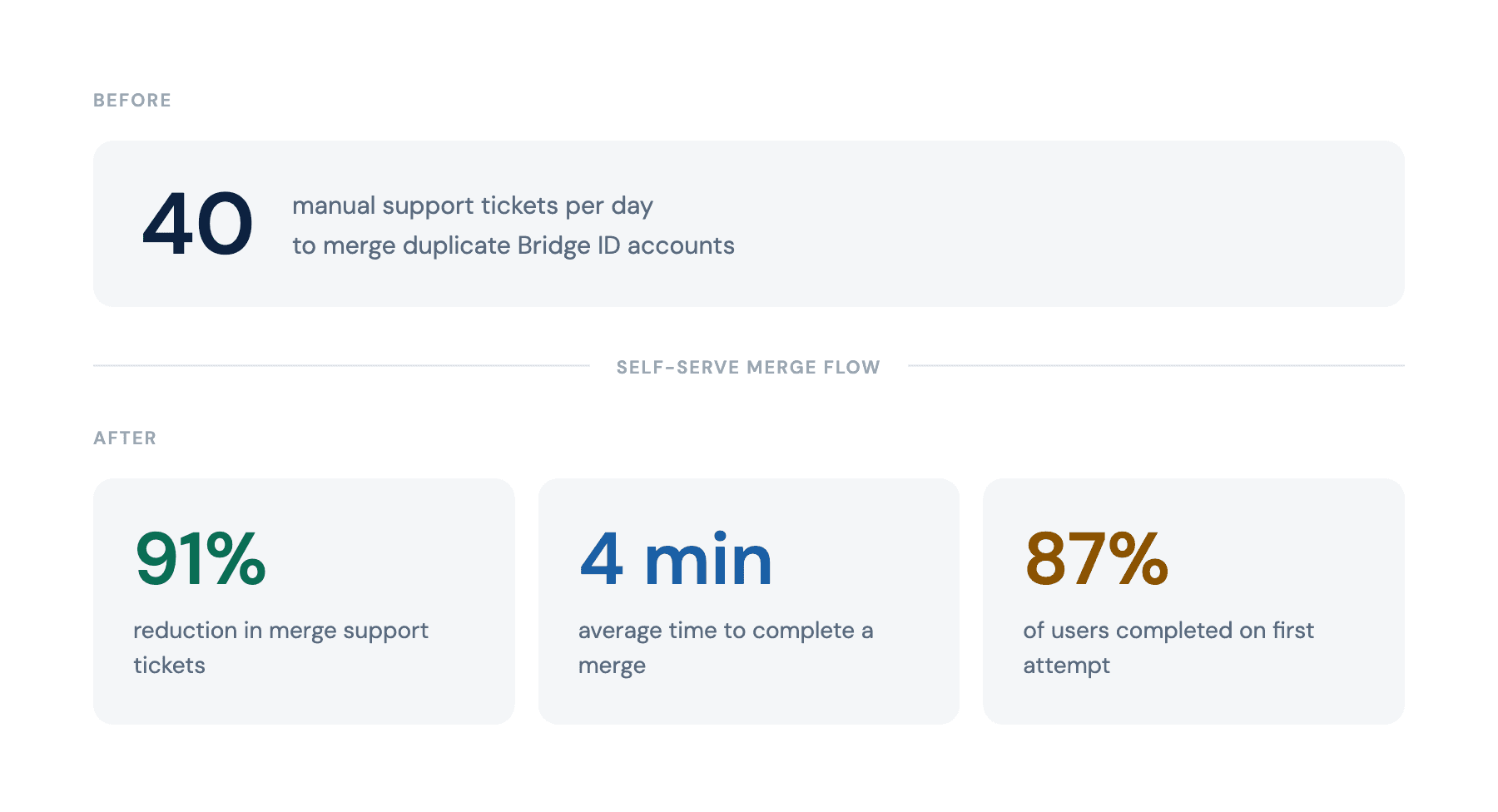
There was no self-serve way to fix it. Dealers had to contact support, and support had to merge accounts manually. At the time the project was scoped, the team was fielding roughly 40 merge requests per day. This project simplified a complex, high-risk process into a secure, guided flow, improving user efficiency while reducing operational costs.
The Problem
Manual merges created two compounding issues. For dealers, it meant submitting a ticket and waiting, which was frustrating experience when they just needed to access a tool. For Cox's support team, it was a significant operational drain: 40 tickets a day adds up fast, and each one required a human to verify account ownership and execute the merge on the backend.
The fix seemed straightforward: build a self-serve flow. But the project was proposed, scoped, and then shelved. Limited engineering bandwidth and budget meant it couldn't get prioritized. It sat until the support volume became too costly to ignore, at which point it was revived and finally resourced.
When someone ended up with duplicate accounts, which happened constantly, there was no way to fix it themselves. They had to call support. Support had to do it manually. And with roughly 40 of these requests coming in every day, it was quietly becoming one of the most expensive line items in the support queue.
Constraints
Budget and timeline were tight from the start, which shaped every design decision. We couldn't build something elaborate. The technical implementation had to stay lean, which meant the flow needed to be simple enough that engineering could execute it without significant infrastructure changes. Every screen had to earn its place.
This constraint was actually clarifying. It pushed me toward the most essential version of the experience: no branching logic, no edge case rabbit holes, just a clear linear path from entry point to confirmed merge.
Discovery
Before touching Figma, I spent time studying how other companies handle account merging. I looked at what worked, what felt confusing, and where flows tended to break down. A few patterns stood out: the products that did it well were upfront about what was permanent, made the outcome visible before the user committed, and kept the step count low. The ones that didn't often buried the action deep in settings, used ambiguous language, or confirmed the merge without giving users a clear picture of what they were about to lose.
That research informed the first round of rough wireframes, which I shared with stakeholders early to align on scope and direction before investing in anything more detailed. With sign-off on the general approach, I built out a more advanced interactive prototype and ran a round of moderated user interviews, where participants walked through the flow in real time.
That testing surfaced two problems that wouldn't have been obvious from a design review alone.
Problem 1: Users didn't know the action was permanent.
Participants would reach the merge step without fully registering what they were committing to. The irreversibility of the action wasn't landing. Several users said they'd want to "go back and check" something, but there was no friction moment that made them do that before confirming.
Problem 2: Discoverability was poor.
The merge entry point was buried. Users who had duplicate accounts often didn't know the feature existed, and even when they went looking, they struggled to find it. The "Attached Solutions" tab in My Settings wasn't an obvious place to surface a merge prompt.
I updated the designs to address both issues, then ran a second round of sessions with participants to validate the changes before finalizing.
Explorations
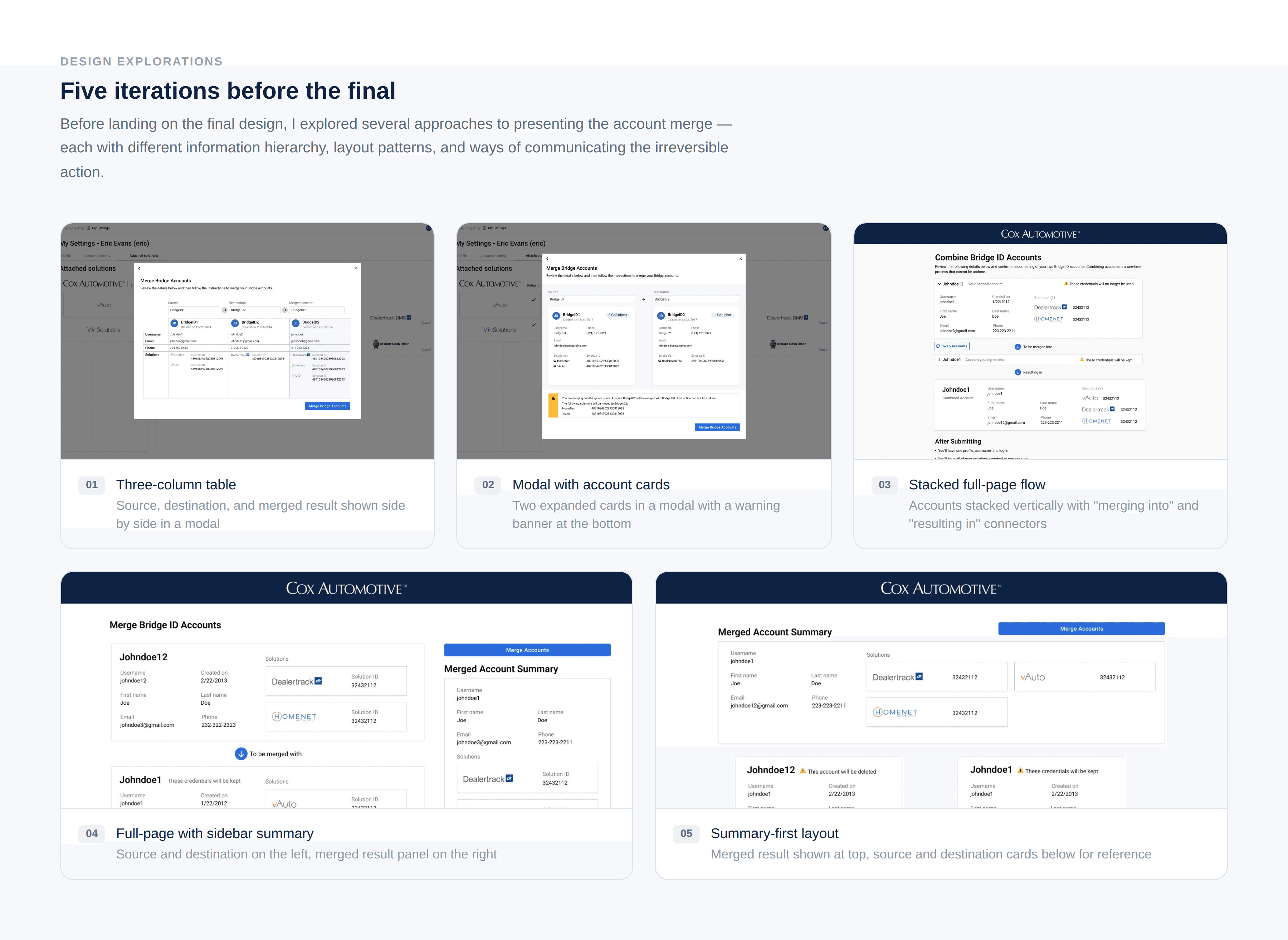
Before settling on a direction, I explored five distinct structural approaches to the review screen, the most complex and consequential part of the flow.
The early options leaned on modal overlays, which kept the interaction contained but created a different problem: the amount of information users needed to verify before confirming a permanent action didn't fit comfortably inside a modal without feeling dense or truncated. A three-column table layout made the before/after comparison legible but buried the irreversibility warning at the bottom, where users were unlikely to read it carefully.
Later iterations moved to full-page layouts, which gave the content more room to breathe. One version showed the merged result at the top with the two source accounts below for reference. This felt logical in theory, but in practice it put the outcome before users had properly read what they were agreeing to. Another placed the merged summary in a sidebar panel, which worked visually but split the user's attention across two columns at the exact moment they needed to be reading carefully.
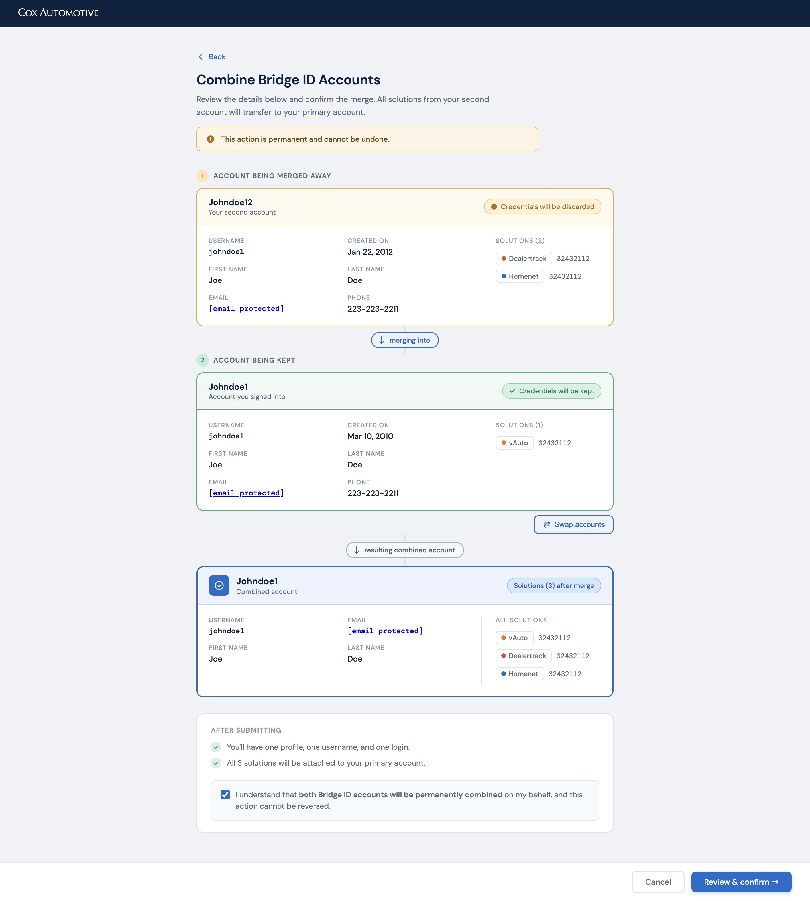
What the iterations kept pointing toward was a linear, top-to-bottom sequence: here is what you are giving up, here is what you are keeping, here is the result. That structure made the direction of the merge unambiguous and gave users a natural reading path before hitting confirm. It also happened to be the simplest thing to build, which mattered given the constraints.
Design Decisions
Confirmation before commitment
The most consequential decision was adding a dedicated review screen before the final merge: a full summary showing exactly which account would be kept, which would be discarded, and what the resulting combined account would look like. Color coding reinforced the direction: amber for the account being removed, green for the account being kept. This gave users a moment to verify before crossing a line they couldn't uncross.
The final confirmation step then required an explicit checkbox acknowledgment: "I understand this action cannot be reversed", so the irreversibility was unavoidable, not a footnote.
Clearer entry point in settings
I added a persistent "Merge Bridge Accounts" prompt directly in the Attached Solutions view, with enough context to explain what it was and why a dealer might need it. Users who had duplicate accounts often arrived at settings for a different reason; surfacing the merge option there meant they could act on it in the moment rather than having to go find it later.
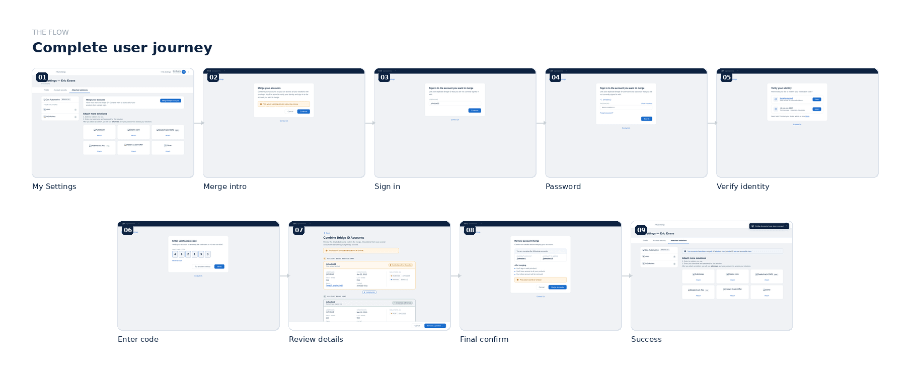
Keeping the flow linear
Given the technical constraints, I designed the full journey as a strict step-by-step flow: verify identity, sign in to the second account, review, then confirm. No branching, no optional steps. Each screen does one thing. This made it easier to build and easier to use, which was particularly important for a population of dealers who weren't necessarily technical users.
Outcome
The flow shipped and was rolled out to dealers. Results against the manual support baseline:
91% reduction in account merge support tickets
4-minute average completion time
87% of users completed the merge on their first attempt without needing support
The feature that had been shelved for budget reasons ultimately paid for itself by removing a significant chunk of ongoing support overhead.
Reflection
This project is a good example of constraints doing useful work. The limited budget meant I couldn't over-engineer the solution, which kept the experience focused. The moderated research was essential. The two biggest design decisions (the confirmation screen and the discoverability fix) both came directly from watching real users hit real walls. Without that, I would have shipped something faster, and it would have generated more support tickets, not fewer.