Enter password to view case study
Designed and built a conversion-focused marketing site

Client
Hatchett Family Law
Role
Web design
Duration
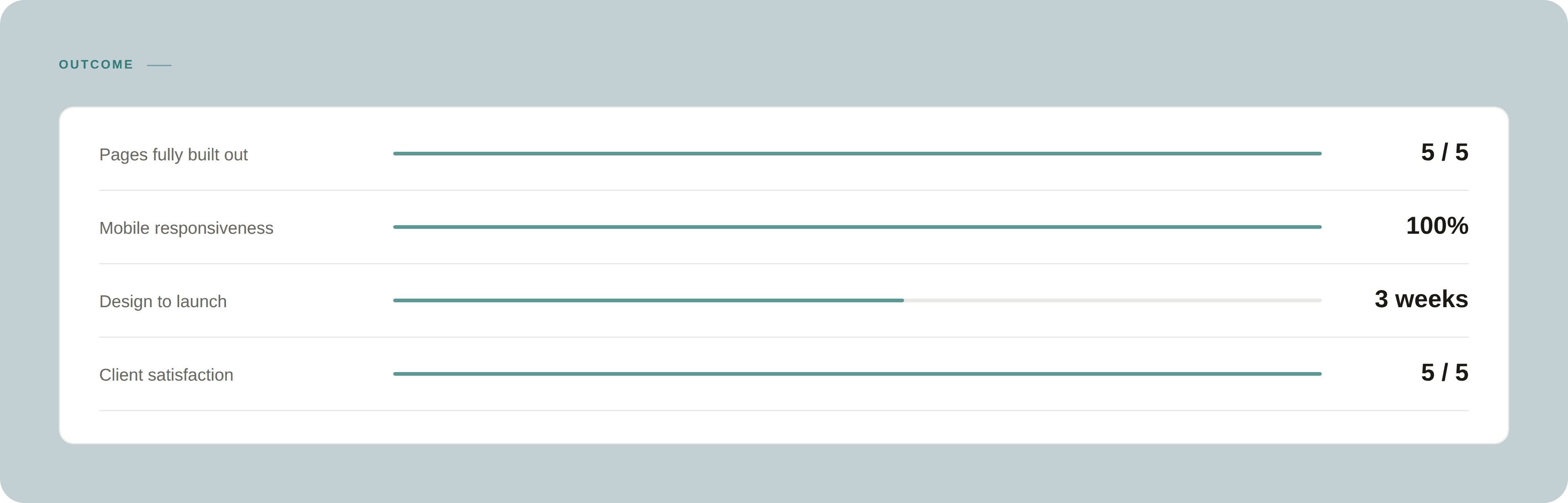
3 weeks
Scope
Web design, copywriting strategy, photography
Overview
Courtney Hatchett is a Board Certified Family Law Attorney in Austin, Texas — a credential held by fewer than 2% of attorneys in the state. She runs a small, focused practice handling divorce, custody, support, and protective orders across Travis and Williamson Counties.
Her practice was growing through referrals, but her website wasn't pulling its weight. Cold visitors — people who found her through search at one of the hardest moments of their lives — landed on a generic template that communicated nothing about who she was, what made her different, or what to do next.

The Challenge
Family law clients aren't comparison shopping. They're scared, often in crisis, and looking for someone they can trust immediately. The existing site created doubt instead of confidence.
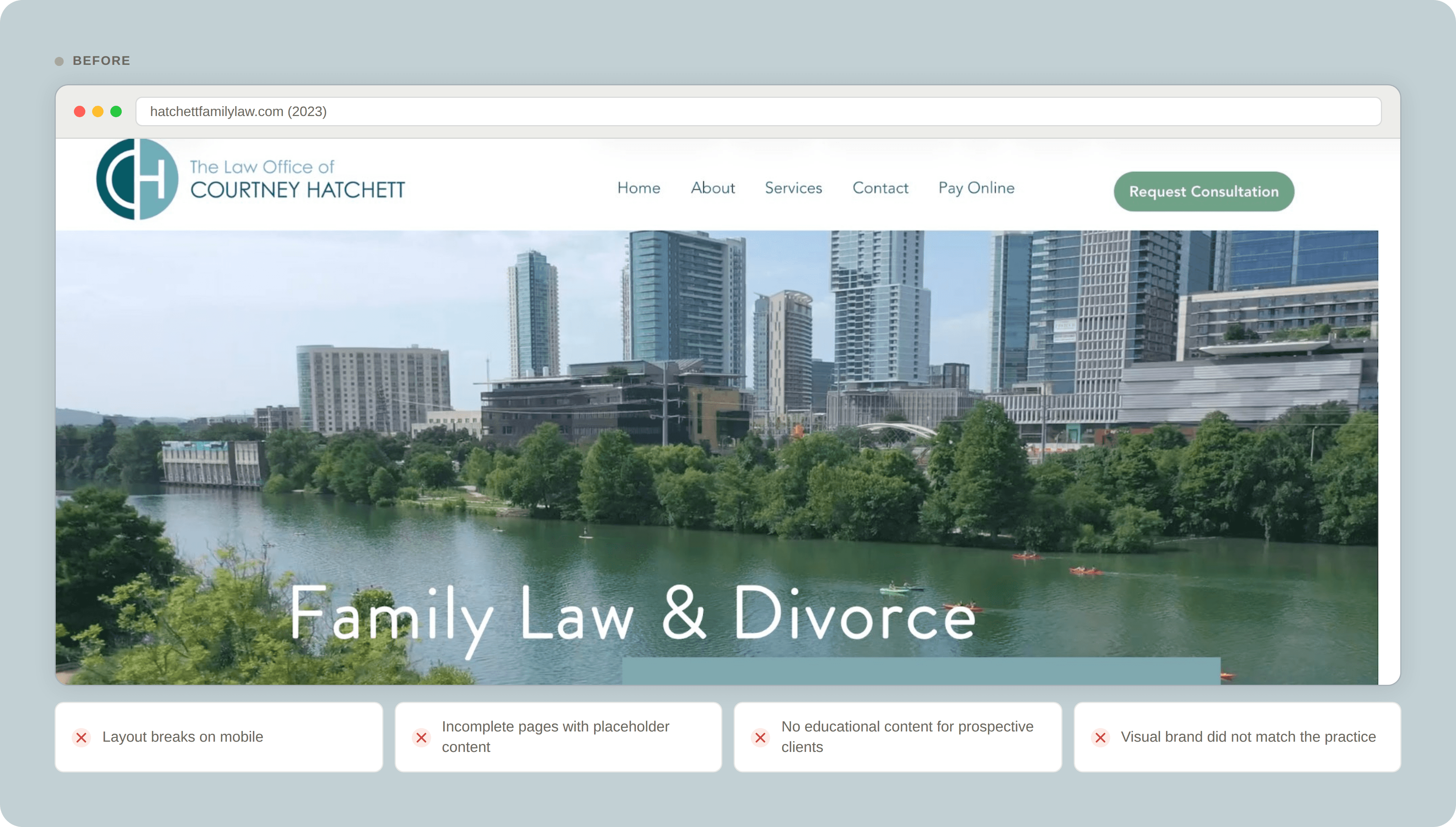
The website had three core problems:
No emotional connection: Generic legal copy that could belong to any firm. Nothing that spoke to the client's situation or made Courtney feel like a real person worth calling.
A buried credential: Board Certification is Courtney's single most powerful differentiator. It was mentioned once, in small text, near the bottom. Most visitors never saw it.
An unprofessional appearance: The site relied on generic stock imagery that felt disconnected from the actual practice and the people behind it. For someone deciding who to trust with their family, that gap between the visuals and the reality of the firm erodes confidence before a single word is read.
The Approach
This wasn't just a visual redesign — it was a credibility project. Before touching the layout, I audited the site through the lens of a first-time visitor in a high-stakes situation: what do they need to see, and in what order, to feel confident enough to book a call?
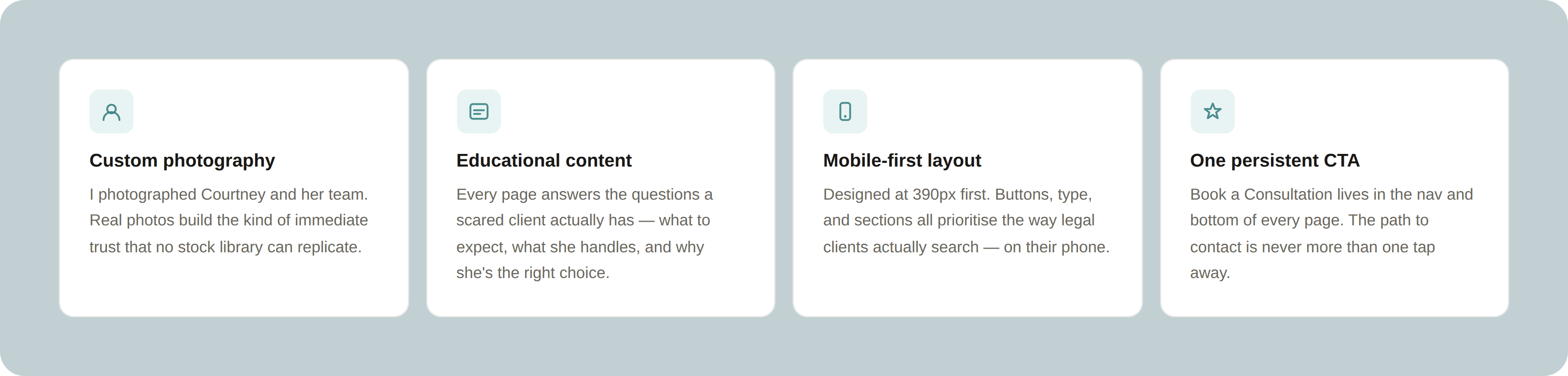
Credibility-first hierarchy
Moved Board Certification to the top of the hero, paired with a headline — "Clarity & Compassion When It Matters Most" — that addressed the emotional reality of the client's situation rather than listing practice areas. Trust signals first. Services second.
Human-centered layout
Designed a "Who You'll Work With" section featuring real photography of Courtney and her paralegal, Samantha. For a small firm, the people are the product. Visitors needed to see who would actually be handling their case.
Conversion architecture
Restructured the full page as a decision funnel: hero with immediate CTA, services presented with enough specificity to match the visitor's situation, client testimonials integrated into the flow rather than hidden in a reviews tab, and a detailed consultation form that pre-qualifies leads before the first call.
A palette that felt human, not corporate
Replaced generic legal grays with a light teal and turquoise palette — warm enough to feel approachable, professional enough to feel credible.
The Rebrand
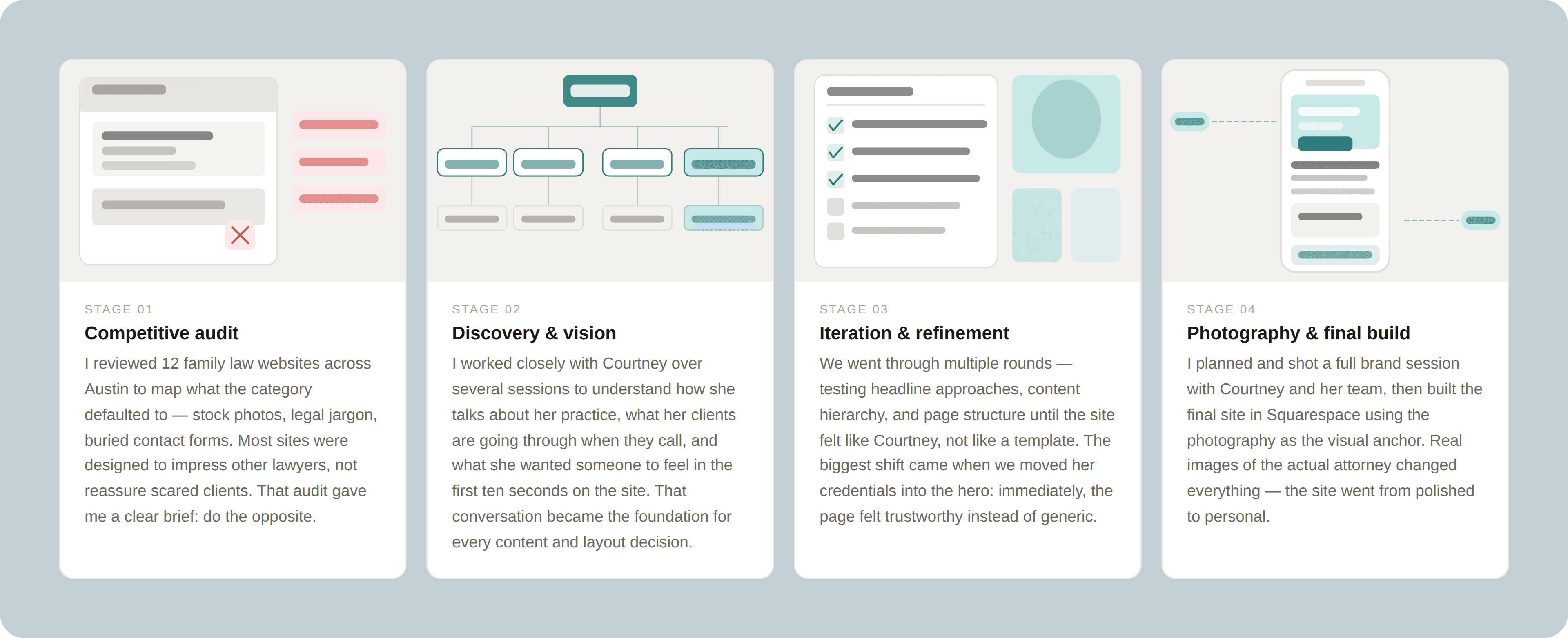
Before I started the design process, I stepped back to understand the landscape. I audited more than a dozen family law websites across Austin to identify not just common patterns, but the underlying assumptions driving them.
What I found was consistent: most firms were designing for their peers. The visual language leaned heavily on authority — dark palettes, formal typography, and dense legal copy — all signaling credibility within the legal community.
But that wasn’t who we needed to reach.
Family law clients aren’t browsing casually. They’re often overwhelmed, anxious, and searching for help in deeply personal moments — sometimes late at night, unsure of what comes next.
That insight reframed the problem.
The rebrand wasn’t about standing out for the sake of differentiation. It was about shifting the center of gravity — from impressing other lawyers to supporting real people in vulnerable moments.
Design Process
Before I opened Figma, I spent time understanding the landscape. I audited over a dozen Austin-area family law websites to identify what the category defaulted to — and more importantly, where the real opportunities were. Most sites were built to signal authority to other lawyers. Very few were built to calm down a frightened person searching for help at midnight. That gap became the brief.
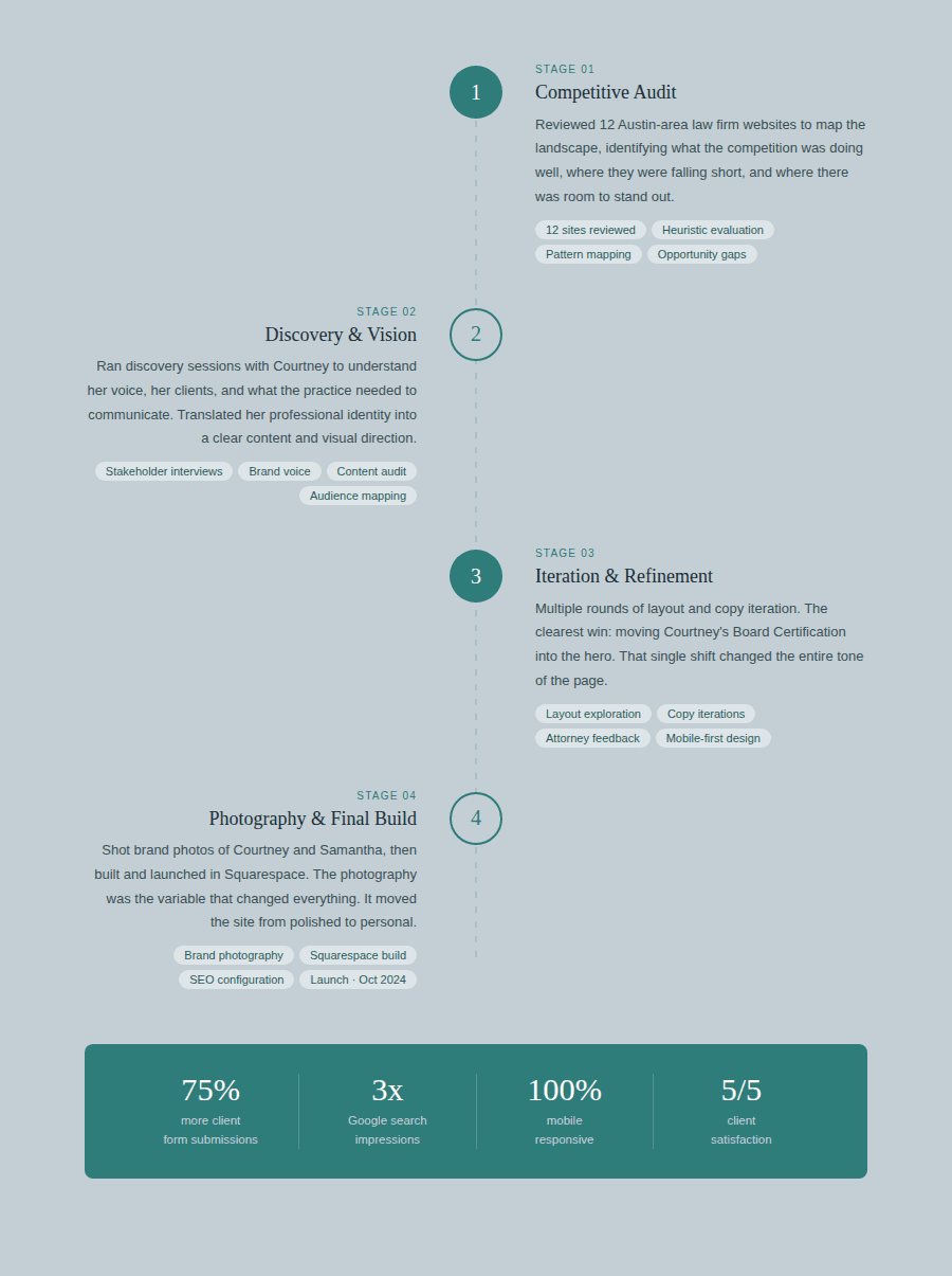
Working closely with Courtney was the part that made everything else possible. She has a warmth and directness in person that her old website never communicated. My job was to translate that — through copy decisions, image choices, layout hierarchy, and the photography itself — so that someone landing on the site for the first time would feel what it's actually like to work with her. That took iteration. We went through multiple rounds of headlines, page structures, and visual directions before it clicked. The moment we placed her credentials and the team photo front and centre in the hero, the site finally felt like her.
The Results
The redesigned site gave Courtney's practice a digital presence that matches the quality of her work. Visitors now encounter her most important credential within seconds of landing. The consultation CTA is visible above the fold on every device. And real client testimonials — including from a domestic violence case — are integrated where they can do the most work.
Courtney arrived at calls with clients who already understood her credentials, her approach, and her firm. The website stopped being a liability and started being an asset.
Mobile Experience
Most people searching for a family law attorney aren't sitting at a desk. They're on their phone, often late at night, in the middle of a difficult situation. Every layout decision — the stacked sections, the large tap targets, the persistent call button — was made with that person in mind.